R Shiny was born with a very strong promise:
No web development skills required.
And it’s true.
You can build high value Shiny applications with R code only.
Zero HTML, CSS, or JS.
But…
Behind that promise hides a reality you can’t ignore for long:
When you build with R Shiny, you are doing web development.
And despite everything Shiny makes possible, it’s still a drop in the massive ocean of the web dev ecosystem.
Pure Shiny works great to build a prototype.
But as soon as you want to move to the next step, you need to go further:
And what I want to talk about in this article: building an intuitive and beautiful interface.
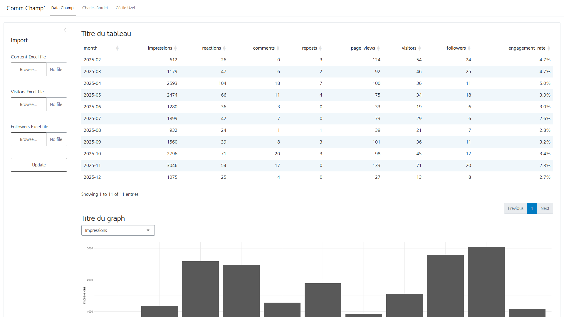
At Data Champ’, we built a small Shiny application for internal use.
Here is what it looks like (click to enlarge):
CommChamp’: original state
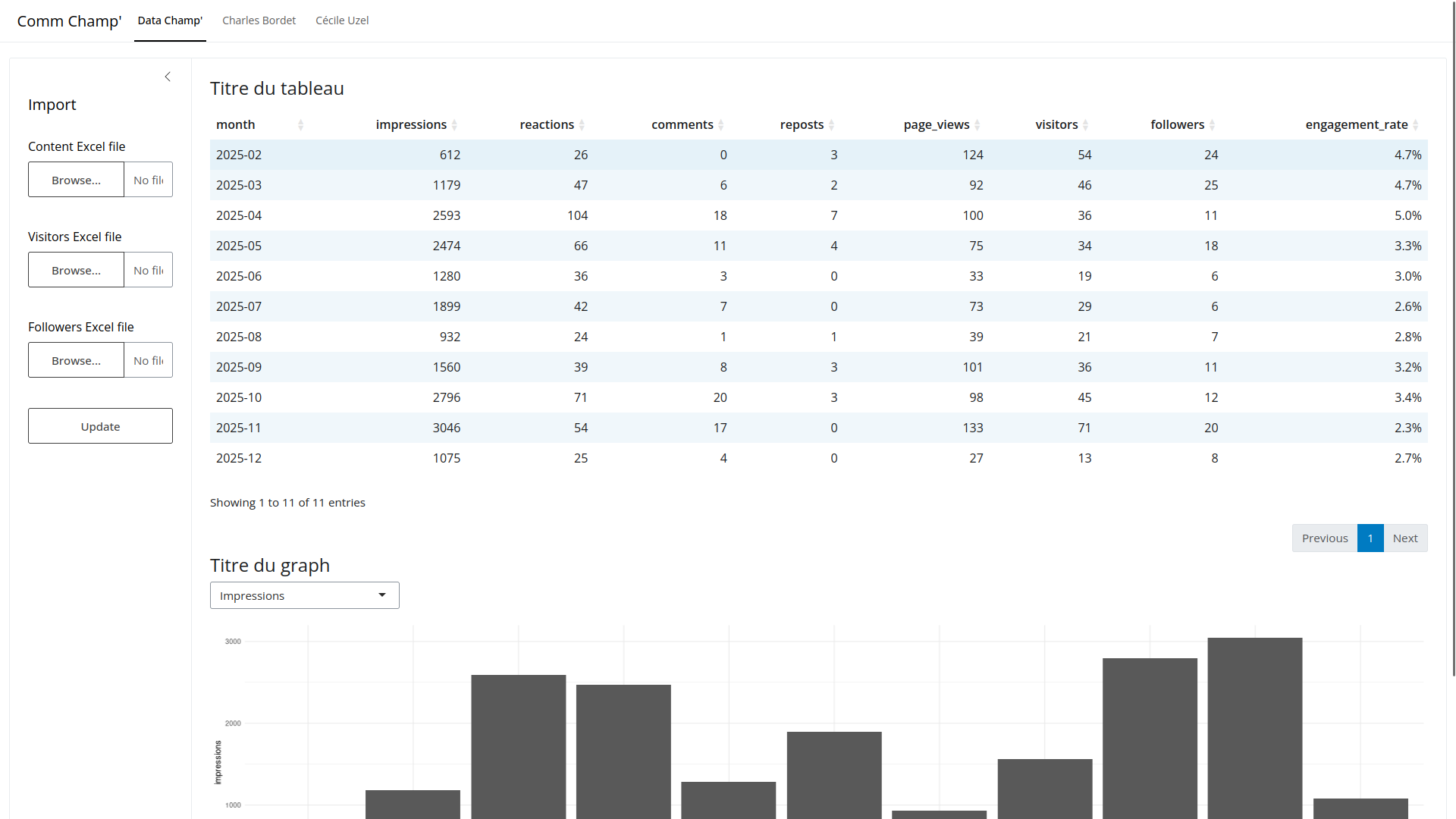
This application lets us track our LinkedIn statistics:
- For the Data Champ’ company page.
- And the pages of two people on our team: Charles Bordet and Cécile Uzel.
What do you think of our app’s design?
It’s default bslib. It works, but it’s far from a wow effect.
I placed the elements without thinking:
fileInputs stacked on top of each other- A
DT::dataTableOutput()table - A
selectInput - And a ggplot2 chart
It’s an app we use exclusively for our internal needs.
So we don’t care about how it looks. I coded it in a weekend, it works, and I moved on.
The problem is that 90% of Shiny applications out there look like this. Including the ones meant for real users.
And that’s normal. When you build a Shiny app, you focus on what matters: the data, the business logic, the interactions, and so on.
Design is secondary. And on top of that… it’s often too far from our core skills.
Except it’s not that secondary in reality. Design isn’t just about “making it pretty”.
First, it’s a real lever of credibility: it influences user trust and adoption. And whether your app is a B2B SaaS, a B2C product, or an internal tool, that matters.
Even for me, at my level, I have an interest in polishing the interface of my internal tools. I’ve already noticed that with some tools:
- The interface isn’t clear and I have to re-explain how it works several times.
- “It’s annoying to use”, so the person avoids it or puts it off.
- Unconsciously, we doubt what we see, because if it’s not polished, we imagine the rest was coded sloppily too.
It’s a real cognitive bias that has been studied in psychology: it’s called the aesthetic-usability effect.
Users perceive an aesthetic interface as easier to use, even when it isn’t objectively so.
To put it bluntly, a well designed app is perceived as more reliable, faster, and more professional.
In this article, I won’t rebuild our Comm Champ’ app from the ground up. But I’ll give you the basics to do it yourself, and I’ll use it as a guiding thread to illustrate.
If you too:
- have a Shiny app that works but looks like an administrative form
- want to give it a professional look without spending weeks redoing everything,
- want to understand the design basics applied to Shiny
- and want to know which tools to use and how,
then this article is for you.
We’ll cover this in several steps:
- 1. The base package doesn’t matter: we demystify the choice between
shinydashboard,bs4Dash,bslib, and so on. - 2. Design principles: typography, colors, spacing, visual hierarchy. The basics to know before coding.
- 3. What is Bootstrap: grid, components, variables, link with Shiny.
- 4. The Bootstrap theme: build a custom theme to give your app a real identity.
Let’s go.
1. The base package doesn’t matter
My client Xavier was already asking the question in 2021:
I built the prototype with
bscollapse(which is simple, unmaintained, limited). I’m wondering if I shouldn’t move everything toshinydashboard/shinydashboardPlus, but I saw there are other options (bs4dash,shiny.react).
It’s the question everyone asks at the start of a new app:
- Use base
shiny: we know it’s outdated and doesn’t look very modern anymore - A
shinydashboard? maybe, but it feels a bit dated too - Why not
bslib? I’m hearing about it more and more - Oh, and I’d seen
shiny.fluent,shiny.react, and so on…
In fact, it’s not the right question to ask.
Because the base package, whichever it is, won’t fundamentally change your application’s appearance if you don’t put CSS behind it.
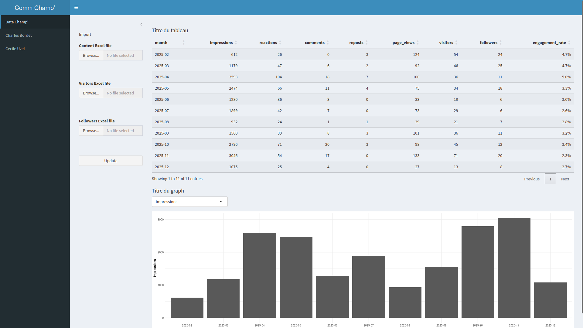
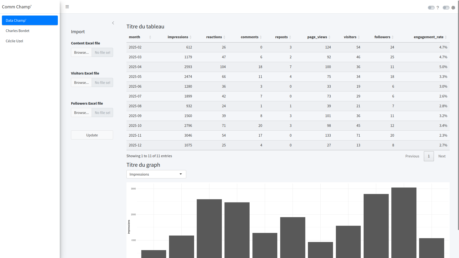
Here is Comm Champ’ with four different packages:
With the shiny package
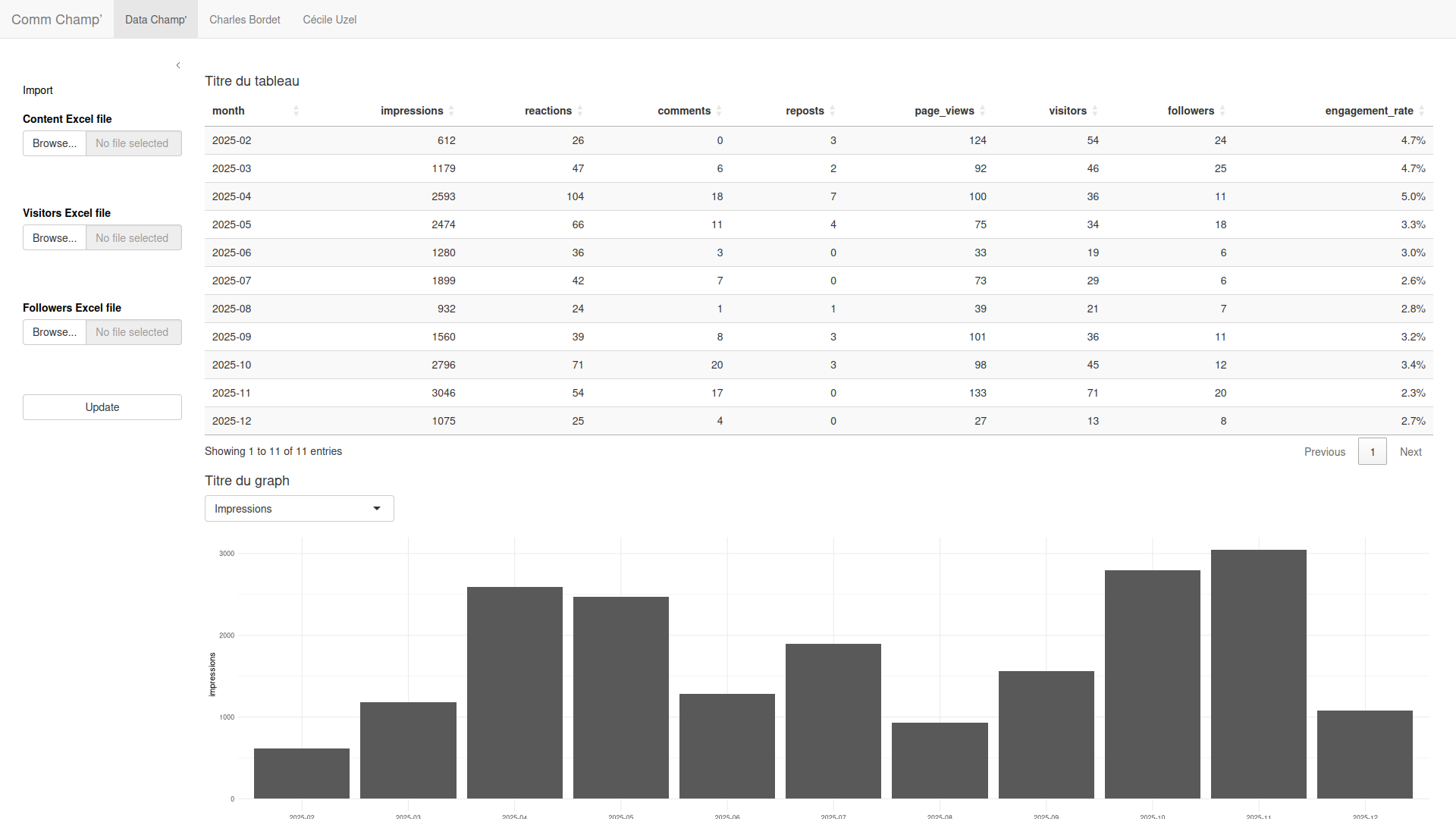
With the shinydashboard package
With the bs4Dash package
Original state
Yes, there are structural differences:
shinydashboardgives you a sidebar and a header by defaultbs4Dashgives you Bootstrap 4 with a slightly more modern lookbslibgives you Bootstrap 5 with a cleaner style
But fundamentally, none of these packages will make your application beautiful and intuitive. They give you a structure and a starting point. That’s all.
There’s no point spending hours comparing shinydashboard and bs4Dash.
The design problem you have is:
- Understanding the design basics (coming up in the next section)
- Writing CSS (or SASS) tailored to your application
- Being consistent in your visual choices
That said, you do need to pick a package. And for my part, the choice has been made for a long time:
I recommend bslib.
Why?
- It’s the official Posit package for layout and theming.
- It uses Bootstrap 5, the most recent and most modern version.
- It’s actively maintained and regularly gets new features.
- It offers a native theming system.
- It provides modern layout components:
layout_columns(),layout_sidebar(),card(),value_box(),navset_bar().
shinydashboard is done. The package uses Bootstrap 3, it’s no longer maintained, and it locks you into a look from 2015. If you have an existing app built on shinydashboard, it will probably be worth migrating to bslib at some point.
bs4Dash was useful in a time when bslib didn’t exist yet. Today, bslib largely replaces it. And it’s barely maintained anymore.
shiny.fluent and shiny.react are no longer maintained either.
2. Before coding: design principles
Before talking about code, CSS, SASS, I’m going to talk to you about design.
Because the best tools in the world are useless if you don’t know what to do with them.
Don’t worry. We’re not going to redo a graphic design course. Just the fundamental principles that, once understood, will transform the way you build your interfaces.
Typography
Typography is the choice of fonts.
And if you think it doesn’t change much… that’s normal. That’s exactly what I thought too. We’re developers, not graphic designers. A font is a font.
Except typography is the interface element your users look at constantly. Everything is text: titles, labels, buttons, tables, error messages. The font is everywhere.
And what it conveys is an unconscious feeling. Imagine the exact same sentence, with strictly the same content, written first in Comic Sans, then in a clean font like Inter.
You may not be able to explain why, but one inspires more confidence than the other. That’s typography: it influences the perception of seriousness, modernity, and professionalism of your app, without the user noticing.
Bootstrap’s default font is a system font (your OS’s native font). It’s perfectly readable, but it’s… generic. Exactly the same as your text editor, your file browser, any system software. Your application doesn’t stand out.
Changing the font is the first step to say: “this application has an identity”.
Here are the basic rules:
- Limit yourself to two fonts maximum. One for titles, one for body text. Beyond that, it looks messy.
- Prioritize readability. For body text, choose a sober sans-serif font: Inter, Open Sans, Source Sans Pro. Keep the more “expressive” fonts for titles, if you really insist.
- Build a size hierarchy. Use different sizes for titles, subtitles, and body text.
Where to find fonts? Google Fonts is the reference. It’s free, there are hundreds of fonts, and bslib integrates them natively with font_google().
CommChamp’: Before
CommChamp’: With the Data Champ’ fonts
I’ll admit it: taken in isolation, the difference isn’t striking on this before/after. And that’s normal, because typography doesn’t do the job on its own. It’s when it combines with colors, spacing, and visual hierarchy that the whole thing comes to life.
But this typography lays the foundations. It will be present on every pixel of text in the app, and it will help create that feeling of “this is Data Champ’”.
Colors
Another topic that’s quite complex for developers. And also the one where they make the most mistakes.
Look at this magnificent color palette I used for a Shiny app in 2019:
An app with really loud colors
You might be thinking: “OK, it’s a bit flashy, but it’s clearly visible, right?”
The problem is that when everything shouts, nothing speaks. The bright yellow, the vivid red, the fluo green: each color fights for attention. The eye doesn’t know where to settle. And after 10 minutes staring at this screen, you have a headache.
Bright colors aren’t forbidden. But they must be used sparingly, to draw attention to something specific: an action button, an alert, a key indicator. If everything is colorful, nothing stands out.
To make a simple parallel: imagine someone who talks by shouting all the time. After two minutes, you stop listening. That’s exactly what an over-saturated palette does.
Here are the three golden rules:
Rule #1: Start from a primary color.
It’s your brand color, or your app’s dominant color. Everything else derives from it. At Data Champ’, it’s the blue #023364.

Rule #2: Limit your palette.
You need:
- 1 primary color (primary): for action buttons, interactive elements, highlights.
- 1 background color (background): usually white or very light.
- 1 text color (foreground): usually black or very dark gray.
- 1 success color, 1 warning color, 1 error color: the classic semantics. Green, orange, red.
- 1-2 secondary colors, if your app needs to distinguish categories.
That’s it. No need for 15 colors.
Rule #3: Use tools.
Don’t invent your palette by hand. Use:
- Coolors: generates harmonious palettes from a starting color.
- Realtime Colors: lets you instantly visualize your palette on a website prototype.
With these tools, you can generate several palettes from the same starting color and compare their effect immediately. Same application, same components, same data: change the palette, and each version tells a different story. That’s the power of colors.
I added my primary color as the background of the navigation bar on Comm Champ’. This simple change immediately brings a little Data Champ’ touch to the app:
Adding a background color on the navigation bar
Spacing
This is THE thing I learned the latest. I saw it everywhere before, but I didn’t understand where that feeling came from.
Spacing is the amount of space between the elements of your interface. We distinguish:
- Padding (the space inside an element)
- Margin (the space around an element)
In a Shiny application, spacing is fine sometimes.
But even with an app as simple as Comm Champ’, you quickly notice inconsistencies:
- The “Comm Champ’” title and the tabs are glued to the very top. Zero breathing room.
- The “Update” buttons are closer to the table than to the
fileInputthey go with. The eye naturally associates elements that are close together. Here, the button seems to belong to the table rather than to the upload field. It’s a design principle called the law of proximity. - The table pagination is lost in the void, far from the content it controls.
All these problems come from a lack of deliberate spacing. Spacing makes an interface more readable, more airy, and more professional.
The principles:
- Increase margins between sections. The app’s blocks should have space between them.
- Increase padding inside components. Cards, tables, buttons, everything needs a bit of air.
- Be consistent. Use a system of multiples. For example: 8px, 16px, 24px, 32px, 48px. Not 7px here and 13px next to it.
Good news: Bootstrap utility classes let you handle spacing easily, without writing CSS by hand. It’s a topic I’ll detail in a future article.
Visual hierarchy
When a user opens your application, their eye should be guided. They should understand at a glance:
- What is important?
- What is secondary?
- Where should I click?
Visual hierarchy is the art of organizing elements to answer these questions without the user consciously perceiving it.
To do this, we use:
- Size: the bigger, the more important. Typically, the main KPI of a dashboard should jump out.
- Contrast: an action button should stand out from the rest of the interface. Use your primary color for important actions, and neutral colors for the rest.
- Position: what’s at the top and left is seen first. That’s where the key information should go.
Let’s take a concrete example. Look at Comm Champ’ in its current state: what jumps out first? Hard to say. The title, the tabs, the fileInputs, the table, everything is at the same visual level. Nothing is highlighted, nothing is secondary.
Now, imagine the same page with these adjustments:
- The main KPI (number of contacts) is displayed large, at the top of the page, in a colored value box.
- The main action button (“Update”) is the only element in a bright color.
- The secondary elements (the fileInputs) are moved to the sidebar, visually pushed back.
Without changing a single line of business logic, the application guides the user.
Consistency
Last principle, and maybe the most important: consistency.
Your buttons should look alike. Tables should have the same style. Titles the same size. If you use rounded corners (a border-radius), use the same radius everywhere.
It seems obvious, but in practice, it’s the most frequent problem. Here is a typical example of what I see:
- A button with corners rounded at 8px… and another at 0px on the same page.
- A title in dark blue in one tab, and in black in another.
- A table with borders in section A, and without borders in section B.
- A
selectInputwith a drop shadow, next to atextInputwithout one.
Each isolated choice may be acceptable. But the accumulation creates a visual patchwork that breaks any impression of professionalism.
It’s as if you wore a checkered shirt, striped pants, and polka dot socks. Each piece is fine on its own. The whole is a disaster.
The best way to ensure consistency is to define a theme.
That’s exactly what we’re going to see in the next sections about Bootstrap.
3. What is Bootstrap
So far, we’ve decided to use bslib, and we said this package is built on Bootstrap.
It’s time to explore in detail what Bootstrap is, what it brings us, and how to leverage it.
Bootstrap is a CSS framework created by Twitter in 2011. It’s quite simply the most used CSS framework in the world in 2026 according to W3Techs, closely followed by TailwindCSS depending on the source.
And what exactly is a CSS framework? Think of it as a complete toolbox for building web interfaces. To really understand Bootstrap, we need to break down what it provides. We’ll detail each aspect, because we’ll need it in the rest of the article.
1. A grid system and components
If you do Shiny, you already know fluidRow() and column(). You know a row has 12 columns, and that you can combine column(width = 4, ...) and column(width = 8, ...) to create a 1/3 - 2/3 layout.
Well, all of that is Bootstrap.
Shiny invented nothing here. fluidRow() generates a <div class="row"> and column(4, ...) generates a <div class="col-sm-4">. These are standard Bootstrap classes.
In the same way, the components you use in Shiny are Bootstrap components:
tabsetPanel()? Those are Bootstrap Navs & tabs.modalDialog()? Those are Bootstrap Modals.actionButton()? Those are<button class="btn btn-default">: Bootstrap Buttons.bslib’scard()? Those are Bootstrap Cards.
Nothing magical. Shiny is an R wrapper around Bootstrap components. That’s reassuring, because it means all the Bootstrap documentation applies directly to your Shiny application.
2. A variable system to customize the theme
This is the part that will interest us most in this section.
Bootstrap defines hundreds of SASS variables that control the appearance of each component. Every color, every font size, every spacing, every border radius is configurable via a variable.
A few examples:
$primary: #0d6efd: your app’s primary color$font-family-base: system-ui: the base font$border-radius: 0.375rem: the corner radius of all components$spacer: 1rem: the base spacing, from which all others are derived$table-striped-bg: rgba(0,0,0,.05): the color of your tables’ alternating rows
And there are hundreds of others. To give you an idea of the scale, here is the full source file: Github - bootstrap/scss/_variables.scss
What’s powerful is that many variables are derived from other variables. If you change $primary, it automatically impacts buttons, links, badges, active borders, and so on. If you change $spacer, all the spacing in the app changes proportionally.
This mechanism is what lets you create a coherent theme by modifying only a dozen variables.
3. Utility classes (overview)
Last pillar of Bootstrap: utility classes. These are ready-to-use CSS classes that let you quickly adjust an individual element, without writing CSS.
For example: text-center to center text, p-3 to add padding, bg-primary to apply the primary color as background.
It’s quite a rich topic that I’ll detail in a future article. For now, just remember that it exists and that it’s very handy.
Bootstrap and Shiny: the link
Now that you know what Bootstrap is, let’s see how it integrates concretely into Shiny.
When you create a Shiny application, even the simplest one, Bootstrap is automatically loaded in the page. That’s what lets Shiny have a pleasant design without you having to type a single line of CSS.
Concretely, when you use fluidPage() (or bslib::page_fluid(), bslib::page_navbar(), and so on), Shiny generates an HTML page that includes a Bootstrap CSS file and a Bootstrap JavaScript file.
To convince yourself, compare an app with bslib::page_navbar() and the same one with a plain div() without Bootstrap: the difference is spectacular. All the layout, the components, the base styles, all of that comes from Bootstrap.
A small subtlety: the base shiny package loads Bootstrap 3, while bslib loads Bootstrap 5, the most recent version. That’s why an app built with bslib immediately looks a bit more modern.
4. The Bootstrap theme
What is a Bootstrap theme?
We saw that Bootstrap offers hundreds of variables to control the look of each component. A Bootstrap theme is simply a set of values assigned to these variables.
You can see the full list of variables on the bslib website: bslib - Bootstrap 5 variables.
Obviously, you don’t need to fill in every variable. Most have very reasonable default values. But the high number of available variables lets you build a theme with a lot of finesse, without writing a single line of CSS.
Still, we’ll quickly see that it’s not always enough and that you’ll often have to get your hands dirty.
Example: building a theme for Comm Champ’
Here is what I get with a good dozen variables:
CommChamp’ with its Bootstrap theme
And here is the theme I created:
// -- Colors -------------------------------------------------------------------

$primary: #023364;
$body-bg: #F6F6F6;

// -- Typography ---------------------------------------------------------------

$font-family-base: sans-serif;
$headings-font-family: sans-serif;
$headings-color: #0466D3;
$headings-font-weight: 700;

// -- Navbar -------------------------------------------------------------------

$navbar-dark-color: #FFFFFF;
$navbar-dark-hover-color: #80ED99;
$navbar-dark-active-color: #80ED99;
$navbar-dark-brand-color: #FFFFFF;
$navbar-dark-brand-hover-color: #FFFFFF;
$navbar-brand-font-size: 1.75rem;

// -- Table --------------------------------------------------------------------

$table-striped-bg: white;

// -- Form controls ------------------------------------------------------------

$input-border-color: #DEE2E6;
$input-placeholder-color: #ADB5BD;
$input-border-radius: 0;
$border-radius: 0;
We find the same identity as the blog you’re reading right now:
- The deep blue appears in the navbar and the table’s page selector
- The flashy green appears in the navbar tabs
- The lighter blue is applied to the titles
- The app uses a light gray background like the blog
- The buttons are sharp with their crisp corners
Even if it’s far from perfect, it’s already a good start.
And to get this result, I only configured 17 variables.
To show the power of this system, you could apply radically different themes on the same app: a dark look à la Spotify, a clean purple look à la Stripe, and so on. Same app, same components, same data, but a radically different identity, by modifying only a dozen variables each time.
“What about Bootswatch then?”
If you’ve already tried to customize a Shiny app, you may know Bootswatch. It’s a set of pre-made Bootstrap themes. It already existed in 2015 when I coded my first app.
It’s super tempting: one parameter to change in bslib::bs_theme(bootswatch = "darkly") and the app magically changes its look.
Except it follows none of the design principles we explained earlier:
- The app still has no soul. It went from a generic template to another generic template.
- The spacing and visual hierarchy issues haven’t moved.
- The app still looks like every other one using the same template. No identity stands out.
It’s nice for tinkering, but if you want a professional application that conveys a real brand identity, you’ll have to push a bit further, exactly like we just did.
How to integrate this Bootstrap theme in Shiny?
You have several options to integrate this theme into your app:
- Use the
_brand.ymlfile and add all the variables. - Use the native Bootstrap method.
Personally, I’m not a fan of _brand.yml.
If you don’t know it, you can discover it on its documentation site.
What deeply bothers me with this tool is that:
- You’re promised to encode your entire company’s visual identity in a simple YAML file.
- The documentation only covers how to change colors and typography.
- For the rest, it’s “You can put Bootstrap variables too. Bye!”
In the end: figure it out yourself.
But above all: this file brings nothing more than what you can already do natively with Bootstrap. To me, it’s an over-simplification that hides the power of Bootstrap from you.
That’s why I suggest the second method, which is equivalent and integrates very well with bslib.
Here is how to create the theme with bslib:
theme <- bslib::bs_theme() |>
    bslib::bs_bundle(sass::sass_layer(
        defaults = sass::sass_file("www/sass/defaults.scss")
    ))
Then, you can pass this theme object into the base function you call. For my app:
bslib::page_navbar(
    title = "Comm Champ’",
    theme = theme,
    ...
)
Finally, as you’ve understood, the list of variables I showed you above goes into the www/sass/defaults.scss file.
How to find the variables you need?
Now that I’ve shown you an example, you probably want to create a theme for your own application.
But where to start? As we said, there are hundreds of variables! We’re not going to test them one by one.
To figure out which variables might be interesting to configure, I follow this process:
- I identify an interface element I want to customize. For example, the navigation bar.
- I find the corresponding page in the Bootstrap documentation. In this case: Navbar
- I scroll down to the Sass variables section (usually at the end of the page)
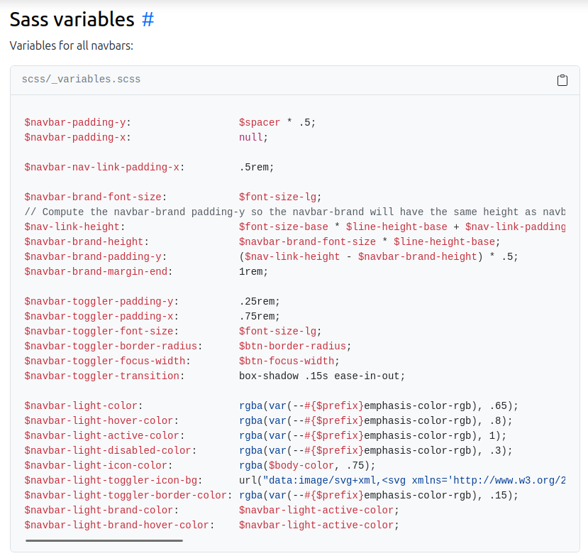
And there, I find all the configurable variables for the navigation bar:
Then it’s up to you!
The first few times, you’ll probably be a bit lost in the navigation. Here are a few tips to help you:
- Anything related to text size is in Typography or Utilities/Text
- Anything related to colors is in Utilities/Colors
- Many Shiny widgets are in fact Bootstrap components. For example, the Cards
The more you use it, the more familiar you’ll be with the structure, and the more you’ll start to know the most frequently used variables.
When variables don’t work
While configuring the Comm Champ’ theme, I wanted to change the text size in the navigation tabs. I searched the Bootstrap documentation, found the variable $nav-link-font-size, and added it to my theme:
$nav-link-font-size: 1rem;And… nothing happened.
I cleared the cache. Restarted the app. Checked the variable name. Everything is correct. But the text size doesn’t move a pixel.
By inspecting the element with the browser DevTools (CTRL + Shift + I, then click on the tab), I finally understood:
The bslib package adds its own CSS rules on top of Bootstrap. And some of these rules override variables you’d expect to be able to configure with a theme.
Here is the excerpt from bslib’s source code that causes the problem:
.nav-underline {
    --bs-nav-link-font-size: 0.875rem;
    // ...
}
bslib sets --bs-nav-link-font-size directly in CSS, which is more specific than the SASS variable $nav-link-font-size we defined in our theme. As a result, our variable is ignored.
And it’s not an isolated case. The same file contains other overrides:
- Default buttons (
actionButton()) are turned into theoutlinevariant via a CSS rule, regardless of your theme variables. - Modals have padding fixed at
1.5rem. - Cards have specific drop shadow rules.
The problem is that this behavior is documented nowhere by bslib. You’ll only discover it by hitting it, inspecting the DevTools, and digging through the source code on GitHub.
The fix: to work around it, you need to write CSS that targets the same class directly. In my case:
.nav-underline {
    --bs-nav-link-font-size: 1rem;
}
It’s frustrating, because you’re fighting against the framework you chose. But once you know it exists, you know where to look. And that’s precisely why a Bootstrap theme, even well configured, will never be enough on its own. You’ll always need to complete it with custom CSS.
What’s next?
We’ve come quite a long way. Let’s recap.
Our application now has a real identity, true to the Data Champ’ brand (click to open it large):
CommChamp’ with its Bootstrap theme
We started from a simple observation: doing Shiny means doing web development, and design isn’t secondary. Then we saw that:
- The base package (
shinydashboard,bs4Dash,bslib…) doesn’t really matter. What matters is the CSS behind it. - The design principles (typography, colors, spacing, hierarchy, consistency) are to be known before coding.
- Bootstrap is the foundation, and
bsliblets you leverage it fully. - A Bootstrap theme lets you lay down a coherent visual identity by modifying only a dozen variables.
A theme is about 80% of the way. But there remain the 20% that make all the difference. Look closely at our app, there’s still plenty to say:
- The title and the menu are a bit cramped
- There’s a weird border all around the body of the page
- The table lacks substance and blends into the background
- The “Update” button is almost invisible
- The fileInputs are squashed by the narrow width of the sidebar
These finishing touches (utility classes, custom CSS/SASS, chart harmonization, icons, dark mode, and so on) will be the subject of a future article. In the meantime, you already have what you need to radically transform the look of your application.
And if you have a Shiny application to take from prototype to product and want to discuss it, get in touch.
Comments