The OFCE (Observatoire Français des Conjonctures Économiques - French Economic Observatory), has recently created the Debtwatch app to simulate economic trajectories and exchange around debt sustainability. An ideal tool for the 2022 French presidential elections!
Only in theory however, because the application was not going to be ready in time. And above all, an important detail was missing: a design that makes users want to come back, to share and to talk about it around them.
In this case study, we will see how DATA CHAMP' helped to fulfill two major objectives :
- To achieve a smooth public launch
- And to transform users into ambassadors of the tool
What I Started With
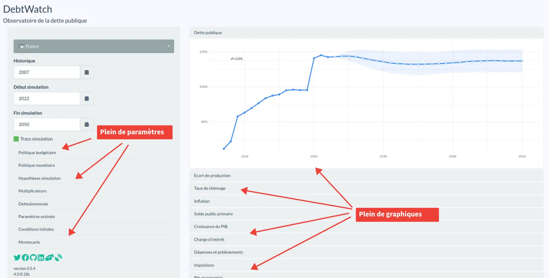
When Xavier Timbeau showed me the application for the first time, it felt a little lackluster.
A sidebar with settings and filters.
A series of graphs that update when you change the filters.
Behind the scenes, some pretty cool macro-economic models that run and simulate scenarios.
Nothing too fancy for a Shiny application.
DebwatchR: Improve UI/UX of an application open to everyone
Goal: Maximize communication of the tool
Customer: Observateur Français des Conjonctures Économiques (OFCE)
As part of the public launch of an R Shiny application, DATA CHAMP’ was called on to improve aesthetics, optimize user experience and develop new features.
Xavier laid out two objectives:
1. Adding new features
These new features included adding social buttons, managing settings in the sidebar or multi-language.
At first, there was no stopping Xavier. Clearly, he had already coded a very functional application. The missing features were not particularly difficult to implement.
It was more of a timing issue. The launch date was already scheduled. And it was coming up fast.
2. Improving the aesthetics
And if we look at the aesthetics (see the screenshot above)… Let’s just say that the basic application wasn’t ugly.
It was sober. Clean. It was okay. Well, for an internal application maybe.
Except that here, the tool was aimed at the general public. We wanted the application to be pleasant to browse and easy to use. We also wanted to be able to recognize the OFCE’s (the French Economic Observatory) visual identity.
I quickly realized that design was not Xavier’s forte.
How do you choose the right basic technology?
When you want to create a dashboard in Shiny, you can save time by using some libraries. And the question on Xavier’s mind was to know which library was the most suitable. Should we use shinyBS, shinydashboard, bs4dash, or shiny.react?
All very good solutions to build a Shiny interface. Besides, there were more possibilities still. 2021 already had a plethora of options. That being said… while the question was completely legitimate, it was not the right approach.
No matter what choice we made, we were always going to get the same result.
That is, a neutral interface.
Sober. Clean. Pleasant to use. Of course.
But also…
Neutral. Generic. Bland. Without personality.
But that’s the point! It’s one-size-fits-all. It’s supposed to be used by anyone, in any context.
Except that we wanted to give the application a unique identity.
We wanted to maximize communication around the tool.
One possibility was to turn our application’s users into product ambassadors.
And for that, we needed more than a sober, clean and neutral tool.
We needed:
- A true visual identity
- An intuitive and easy to use dashboard
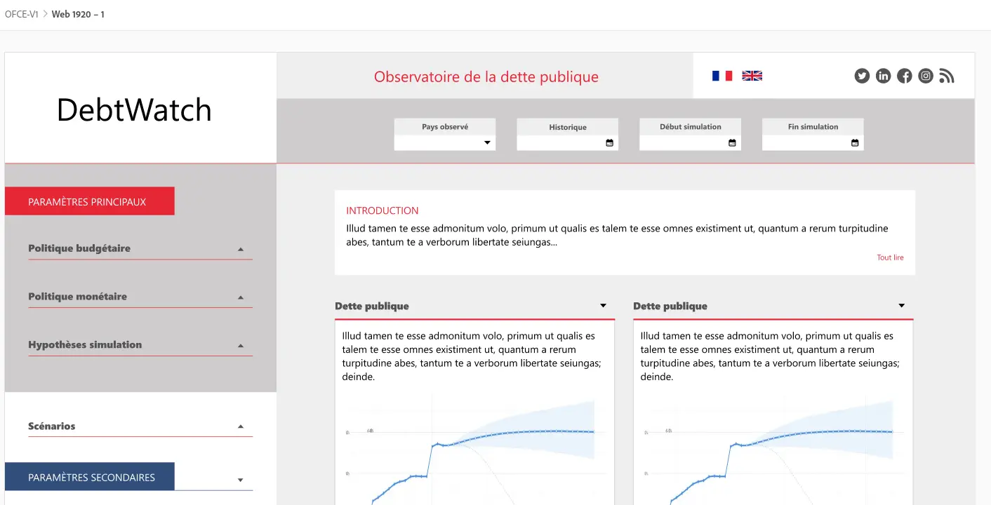
Preparing a graphic mock-up
Design is comprised of two main fields: UI and UX.
User Interface, or UI, is about creating the interface and making it pretty.
User eXperience, or UX, is all about how the user will interact with the application.
Basically, we want something that is both aesthetically pleasing AND practical. That’s how you maximize adoption.
UI and UX is a real job.
And it’s clearly not mine. I have no artistic taste, no ability to conceive another design.
For these issues, I call on an expert: Cécile Uzel, graphic designer and founder of the Atelier Qui Fait Mouche.
I presented her the application, how it worked and our objective.
I had no idea what the application would look like.
But when I saw the mock-up, I immediately thought: “Of course!”
You can instantly recognize the OFCE’s visual identity:
Here is the link to the OFCE website for comparison: Link
From there, we only had to integrate all that in a code in R Shiny.
That’s when a question popped up…
Should we go for shinyBS or shinydashboard? A no-brainer.
Neither of them actually.
In fact, it’s much easier to start from scratch by building the blocks with HTML and CSS.
Creating the HTML structure of a Shiny application
You might think it’s a waste of time to recode everything in HTML instead of using a package like shinydashboard.
But far from it.
HTML is actually the easiest part.
As Shiny uses Bootstrap by default, we are not even starting from scratch.
In fact, Bootstrap already gives us a lot of tools.
For example, the possibility to use a grid with the column system with the functions fluidRow() and column().
Here is how to build a dashboard structure:
fluidPage(
  fluidRow(
    id = "title_panel",
    # Header content
  ),
  fluidRow(
    id = "body",
    column(
      id = "sidebar_panel",
      width = 3,
      div(
        # Sidebar content
      )
    ),
    column(
      id = "main_panel",
      width = 9,
      div(
        # Main content
      )
    )
  )
)
And voilà! For the rest, we add the content.
If you are curious, here is the interface’s code: Link to the Github repository
Note the use of the id parameter.
id will be used a lot later in CSS to customize the appearance. They allow to create what we call selectors.
Because yeah, by default, it won’t be pretty.
If we use a package like shinydashboard, we will have a correct appearance by default. But it won’t be customized, it will lack a marked identity. This is fine in some cases. But not in ours.
All that remains is to code the visual part! And for that, you have to write CSS.
Using the sass package to write CSS easily
My favorite tool for everything related to graphics is the sass package.
sass means Syntactically Awesome Style Sheets. It’s a kind of CSS extension.
I mainly use it to prioritize my CSS code, which is easier to read and write.
For example:
#main_panel {

  padding: 50px 7%;

  .introduction {

    position: relative;
    background-color: white;
    padding: 10px 25px 30px 25px;
    margin-bottom: 20px;

    h3 {
      font-size: 20px;
      color: $red;
      text-transform: uppercase;
    }
  }
}
While in CSS, it looks like:
#main_panel {
  padding: 50px 7%;
}

#main_panel .introduction {
  position: relative;
  background-color: white;
  padding: 10px 25px 30px 25px;
  margin-bottom: 20px;
}

#main_panel .introduction h3 {
  font-size: 20px;
  color: $red;
  text-transform: uppercase;
}
It’s not necessarily that obvious. But the CSS file has no structure and the selectors are much longer. On this small example, it’s no big deal. But when you have hundreds of lines, it’s nice to be able to structure and prioritize the selectors!
Again, if you are curious, the code is available on the Github repository: Link to the SASS files.
In the end, the model was not very complicated to integrate.
Except for one small detail…
Creating your own widgets in Shiny
One of the challenges we had to address was being able to display the parameters on the left in a way that was both:
- Condensed: because there are a lot of them; about a dozen sliders.
- Easy to understand: the user needs to know intuitively how to modify the parameters.
- Easy to read: the selected values must be easy to consult.
Clearly, the original solution did not allow for all these points.
It used bsCollapse for the condensed part. It was not clear that these were drop-down menus. And above all, there was no easy access to the selected values.
Another problem: the design of Shiny’s sliderInput.
It takes up a lot of space!
Compare with what was planned in the mock-up:
Slider 1:

Slider 2:

Beyond the visual aspect and the colors, there are many problems to solve:
- Removing the graduations and refining the horizontal line.
- Placing the minimum and maximum values on the far left and right and not above the bar.
- Reducing the size of the button that you move from left to right.
…
I quickly realized that I would need to recode a widget.
Creating your first widget from scratch can be a daunting task.
And there isn’t much documentation available regarding how to do so.
RStudio has two interesting articles:
- Build custom input objects: a good introduction.
- How to create custom input bindings: in this article, you will find an example.
These are good introductory articles… but nothing more. There are important parts missing if you want to code a fully functional widget.
In fact, they even write:
“In addition to the previously discussed methods, several other JavaScript methods can be added to your input binding object, notably; getId, getState, getRatePolicy, receiveMessage and unsubscribe. These are discussed in the various references provided and are not further discussed here.”
Except, well, they are not really discussed in the references they mention.
Among those are the other article I quoted, which is also introductory, but otherwise there are only links to examples on Github.
So, basically, what they mean is: “Figure out the rest ”
Anyway.
In the end, further research led me to:
- Debugging Custom Shiny Inputs: I found a little more info on the JavaScript methods I needed to code.
- 7 easy steps to custom inputs in shiny: there, I even found a guide to create a widget from scratch. Again, you won’t have all the information. But with the other articles, you can get a good grasp of what you are trying to accomplish.
And then, well… The best way to learn is still to dig around into the code.
So I checked out the original sliderInput function’s code. I also made good use of what has been done in shinyWidgets.
And after a while, you get the hang of it.
The created widget is not perfect, especially since it does not generalize very well to other applications. But it works. It does exactly what the mock-up intended:
If you are curious, here is the code:
- The R code: contains the widget’s HTML code. In the end, it’s nothing more than an
inputtag ofrangetype. - The CSS code: of course, it bears the OFCE colors. But you shouldn’t have any trouble changing them.
- The JavaScript code: this is where we find the code to make a Shiny widget. And this is also where we calculate the margin to display the value just above the slider. We’ll probably have to change this calculation in another context.
There is also a piece of code to update the value in the slider’s “container”.
In short, it’s far from being all-purpose.
But in the end, once I got over the first mistakes on the documentation, the creation of a new widget was quite easy.
Mission accomplished!
The application was launched at a press conference in October 2021.
It was a huge success from the moment it was released. About 10,000 scenarios were simulated in the first 2 weeks.
After that, the traffic naturally went down. But it is now following a slightly increasing slope thanks to the numerous tools put in place facilitating the sharing of graphics or simulations on social networks.
We are therefore entering a phase of continuous improvement of the application. Our goal is to further improve the user experience by taking into account user feedback. We are working, for example, on the possibility to easily find the simulated scenarios from one time to another.


Comments