The client and the context
Réseau Grandir Ensemble follows vulnerable children in the Pays de la Loire region of France, born prematurely or with a severe condition, from birth to the age of seven. It is part of Réseau Sécurité Naissance, the region’s perinatal care network. About 300 referring physicians carry out the consultations, supported by a coordination team of about five people.
When a child needs a physiotherapist or a speech therapist, the family has to be referred to a professional close to home. Ghislain Leduc, the network’s epidemiologist, had built a Shiny application for this, reserved for the coordination team. You enter a family’s address, and the application ranks the network’s professionals by distance.
The problem
The network wanted to open this tool to the referring physicians. Its specifications asked for a simple, user-friendly interface, for an audience not used to this type of application. They did not describe it any further.
Ghislain Leduc says so himself in his testimonial. On usability, “our expectations were less clearly defined, because it requires a certain level of expertise to imagine what is feasible and in which direction to go”.
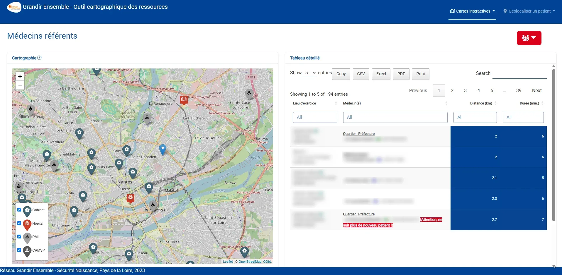
The existing application spread referring physicians, allied health professionals and care facilities over three pages. Each page had its own map, its own table and two filters.
What we did
Start from the existing tool. Since the specifications did not describe the interface, we started from what the team was already using. At the kickoff meeting, Ghislain Leduc demonstrated his application and commented on it, and several needs came out that the specifications did not mention: keeping the family’s address when switching tabs, linking the map and the list, producing an export to hand to the family. He then added that a single filter and a single map seemed preferable to him.
Show a mockup. From these elements, Cécile, the team’s designer, drew the screen in Figma, in a desktop version and a mobile version, in the network’s colors. We presented this mockup to the client 13 days after kickoff. The network’s team then had an interface in front of them to give an opinion on.
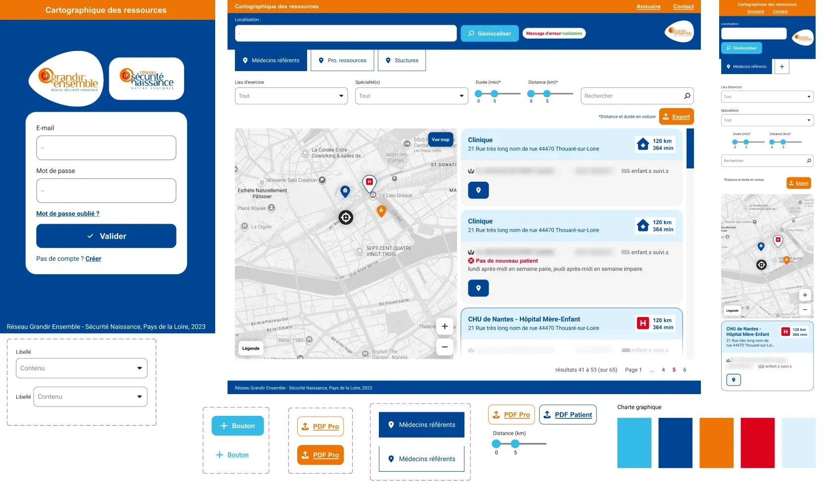
Decide in front of it. A mockup raises questions that specifications do not, and the decisions were made during the meeting. Looking at the address field, the network’s team asked what the user would see if the address was not found. So we planned an error message for that case, and a confirmation message when geolocation succeeds. It was also in front of the mockup that the export for families, with the name, address and phone number of the professionals, was identified as the most important feature of the application.
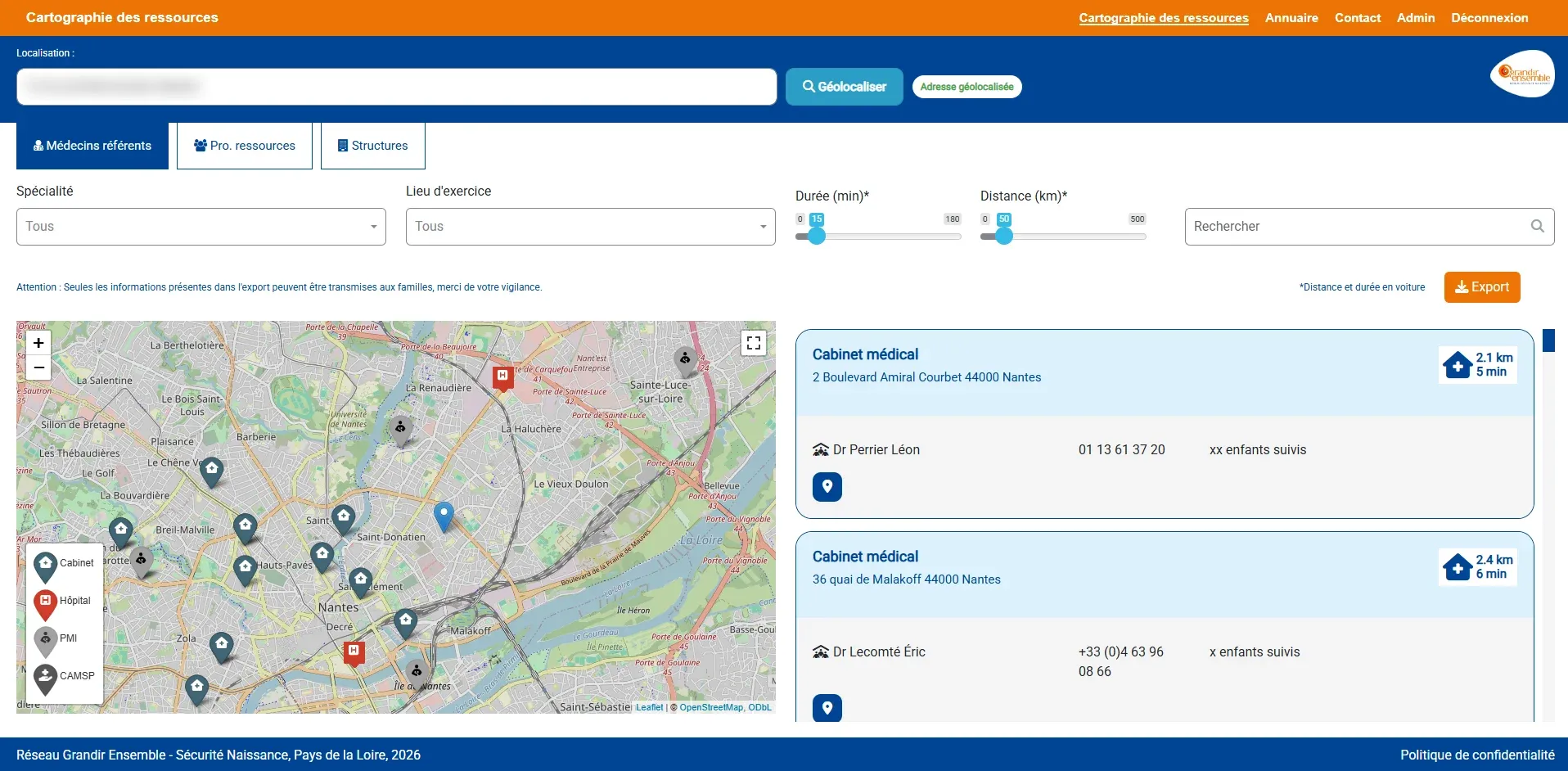
In the delivered application, the physician enters the family’s address at the top of the screen, and a message confirms that it was found. They choose what they are looking for, a referring physician, an allied health professional or a facility, then set the distance and travel time they accept. The map and the list show the closest professionals, with the driving time. They then export this list as a PDF to hand to the family.
The results
The application was delivered for acceptance testing on the planned date, five weeks after kickoff, and it has been in production since January 2026.
Usability was the point the network was least able to describe at the start. Ghislain Leduc concludes in his testimonial: “The application as it was delivered fully meets our functional needs, as well as expectations in terms of usability improvements and user experience.”
A few months later, he confirmed to us that the application was rolled out to the network and was causing no problems.
Do you have an application to open to new users, and an interface to rethink for them? Get in touch.